
Most of these case studies come from emails my readers send me. With their permission, I share them with the names changed. I do this so that others can learn from what worked and what didn't. Have a story of your own? Share it with me.
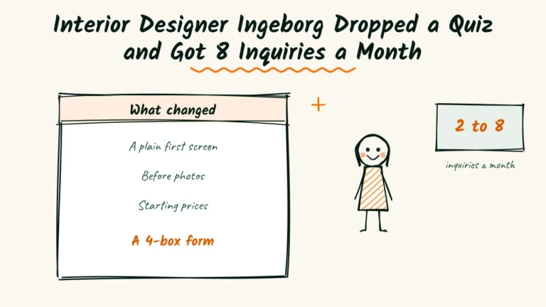
- 2 to 8inquiries a month
- 12 to 4steps before saying hello
- 6project stories with before photos
Step three of twelve.
That’s where most visitors quit the style quiz on Ingeborg Kessler’s old site, right after “choose a sofa shape.”
Her rebuilt pages are now an interior designer website example she shows at local meetups.
Ingeborg is a solo designer in Lewes, Delaware.
She’s known locally for calm beach cottages that still work for families with sandy kids and dogs.
Her interior designer website looked like a magazine. But it brought in only about two inquiries a month, and many weren’t a good fit.
Over one winter she rewrote five pages. Monthly inquiries rose to eight.
The problem
Ingeborg had spent good money on beautiful photos. Her site showed them off in large, clean galleries with almost no text.
Visitors admired the rooms but couldn’t figure out the next step. Three questions kept going unanswered.
Where were the before photos?
Every project showed only the finished room. Nobody could see what the cottage looked like when the client bought it.
One caller asked if the rooms were staged for a magazine. To her, the change looked too perfect to be real.
What would it cost?
The services page ended with “Inquire for pricing.” There were no ranges, no starting points and no hint of a design fee.
Some callers expected a full home for a few thousand dollars. Others assumed she only worked on mansions and never called.
Why did people quit the form?
The inquiry form opened with a twelve-step style quiz.
It asked about sofa shapes, color moods and favorite materials before it asked for a name.
Her site tool showed that most people dropped off by the third step. Only the most patient visitors ever reached the contact boxes.
The solution
Ingeborg decided her site should work like the design briefs she wrote for clients.
Clear sections, plain words and one obvious next step.
She kept her photos and layout. She changed the words, the order and the form.
The interior designer website example visitors now meet first
Her new first screen says “Beach house feeling unfinished? Calm, sand-friendly homes in Lewes and Rehoboth. Projects from $5,000.”
Under those lines sits one button, “Book a room chat.” It leads to a short paid visit, which became her most popular first step.
Project stories with before photos
Under each of her six best projects, she added a five-line story. The client, the problem, the plan, the budget range and the result.
She dug out old phone photos taken on first visits. Even blurry ones worked, because they proved the change was real.
Prices people could plan around
The services page now shows three options with starting prices. A room chat, e-design and full service.
She also explained the difference between her design fee and the cost of furniture, in three plain lines.
A form that starts with a hello
The new inquiry form asks for name and email, which rooms, a rough budget range and two optional photos. The style quiz is gone.
She now asks style questions on the first call instead, where she can hear the answers and ask follow-ups.
The process that worked
Ingeborg worked on the site during the quiet months between holiday installs and spring projects. She used things she already had.
Each one helped her see the site the way clients did.
A list of her last ten clients
She wrote down how each recent client had first described their problem. Not in design terms, but in the words they actually used.
“It feels like a rental.” “Nothing goes together.” “The kids wreck everything.”
Those phrases went straight onto her homepage and service pages.
A shoebox of before photos
Ingeborg kept a box of printed photos from first visits, plus hundreds on her phone. She sorted them by project over two evenings.
Matching each before photo with its after became the backbone of her project stories.
A friend’s honest red pen
A friend who works in a bank read every page with a red pen. She circled each word she wouldn’t use in real life.
“Curated,” “bespoke” and “elevated” all got circled.
Ingeborg replaced them with words like “warm wood,” “soft linen” and “easy to clean.”
What we learned from here
Many designers look for an interior designer website example with stunning visuals. Ingeborg already had those.
What she lacked were words that guided people.
Once her site explained who she helped, what it cost and how to start, the right clients began to reach out.
Showing prices filtered gently
Ingeborg worried that starting prices would scare people away. Instead, they did the sorting for her.
Fewer calls ended with a budget mismatch, and her room chats filled up weeks in advance.
Before photos built belief
The old question about staged rooms disappeared.
Clients now mention the before photos on their first calls, often with a laugh about their own homes.
Those photos also made her work look more personal. People could see a real home changing, not just a styled shoot.
| Clients wrote in | Clients clicked away |
|---|---|
| “Beach house feeling unfinished?” | “Curated coastal living” |
| Starting prices for three services | “Inquire for pricing” |
| Before and after with a short story | Finished rooms only |
| A four-box inquiry form | A twelve-step style quiz |
| A paid room chat as a first step | Full service as the only option |
Ingeborg also learned that her photos needed better names behind the scenes.
She renamed each file and added short descriptions of what was in the room.
The free PageSpeed Insights tool also showed her that some photos were far too large.
Shrinking them made her galleries load much faster on phones.
She now adds one new project each season, with its before photo and five-line story. She retires one older project at the same time.
That small habit keeps the site honest about what she does today.
It also gives her a reason to call past clients and ask how their rooms are holding up.
Designers starting the same work can follow her order.
Rewrite the first screen, add starting prices, then turn your best project into an interior designer website story with a before photo.
Ingeborg’s next step is a short page for clients who live inland. Many of them want a beach feel without living by the beach.
More case studies
Wedding Planner Rosamund Added Starting Prices and Got 11 Good-Fit Inquiries a Month

- 3 to 11good-fit inquiries a month
- 3 to 0wrong guesses about her job
- 4boxes on the new form
Tamsin Changes 6 Menu Words and Gets 13 Inquiries a Month as a Maternity Photographer

- 5 to 13inquiries a month
- 3 to 8in 10 forms completed
- 9 to 21maternity sessions in a quarter
Esthetician Annelise Renamed 1 Facial and Got 17 Online Bookings a Month

- 6 to 17online bookings a month
- 14 to 8services on the menu
- 3rewritten claims per page
Math Tutor Odessa Moved Her Prices to the Homepage and Got 10 Inquiries a Month
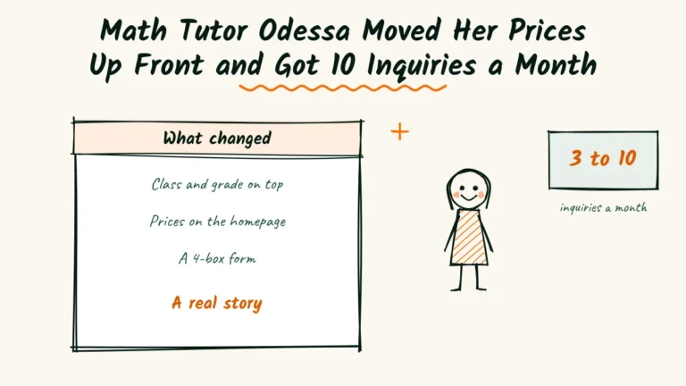
- 3 to 10new inquiries a month
- 11 to 4boxes on the booking form
- 4 pagesrewritten, no redesign
Brand Photographer Bertrand Fixed 3 Hot Spots on His Website and Got 11 Messages a Month

- 3 to 11form messages a month
- 5shoots booked
- 14 to 5form fields
Personal Branding Photographer Laurel Cut Her Website to 7 Pages

- 2 to 9inquiries a month
- 11 to 7pages on her site
- 9 to 3fields in her form
Marisol Rebuilds Her Site for Late-Night Phones, and This Newborn Photographer Gets 11 Inquiries a Month

- 11inquiries a month, up from 4
- 8sessions booked a month, up from 3
- 2 sechome page load time, down from 6
Noor’s Portrait Photographer Website Goes From 1 Message a Month to 11 With Plainer Words

- 1 to 11messages a month
- 6 to 190visits to the sessions page
- 6sessions booked