
Most of these case studies come from emails my readers send me. With their permission, I share them with the names changed. I do this so that others can learn from what worked and what didn't. Have a story of your own? Share it with me.
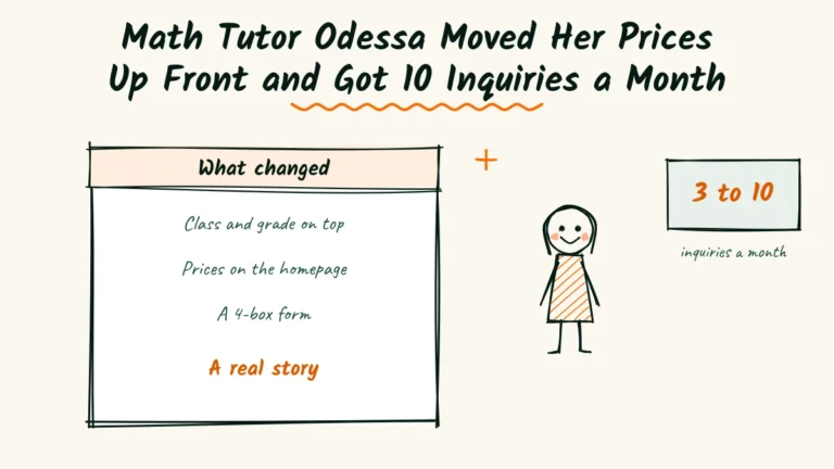
- 3 to 10new inquiries a month
- 11 to 4boxes on the booking form
- 4 pagesrewritten, no redesign
The tab said “Rates and Policies.” In two years, almost nobody clicked it.
Odessa Bellamy tutors middle and high school math in Montrose, Colorado.
Her site is now a math tutor website example other local tutors ask to see. It didn’t start that way.
Yet only about three families a month reached out, and some of those never booked. Parents were visiting, then quietly leaving.
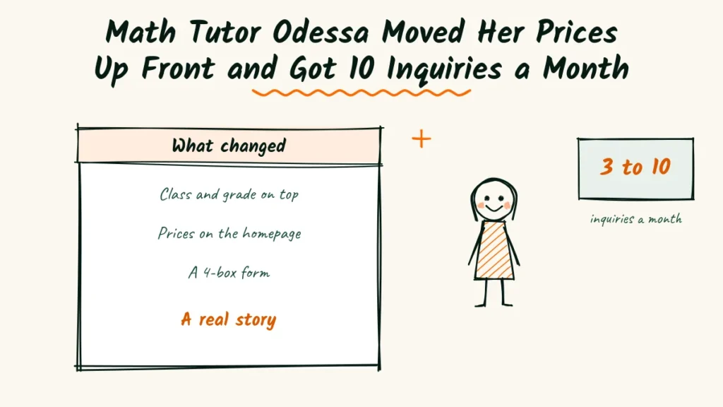
Over one school term, Odessa rewrote four pages. New inquiries rose to ten a month, and most free chats turned into paid sessions.
The problem
Odessa had built her site the way she wrote lesson plans. Neat, complete and full of teacher language.
Parents found it, but the site never answered the questions they cared about first. Three numbers told the story.
Zero prices on the main pages
Her rates lived behind that “Rates and Policies” tab, in a long PDF. Most parents never saw them.
On calls, many asked about cost in the first minute. A few hung up when they heard it, because they’d expected something else.
Eleven boxes on one form
Her sign-up form asked for the student’s school, teacher, last report card, learning style and more. It had eleven boxes.
When Odessa checked her site tool, she saw many parents opening the form and very few finishing it.
One stock photo and no voice
The homepage showed a stock photo of a smiling teacher at a whiteboard. It wasn’t her.
Her About page listed degrees and certificates but never said why she taught. Parents had no sense of who would sit with their child.
The solution
Odessa decided to write for the parent holding a bad test at 9 p.m. Every change had to help that person decide quickly.
She focused on four pages and left the design alone.
The math tutor website example parents now see first
Her new homepage opens with three short lines. “Algebra or geometry feeling too hard? One-on-one help for grades 6 to 12.
In Montrose or online.”
One button sits under those lines. It says “Book a free 15-minute chat.” The old “Learn more” button is gone.
Prices where parents look
She moved her rates onto the homepage and the booking page.
A single session, a monthly plan and an exam prep pack, each with a plain price.
Under the prices, she added one line about cancelling. “Cancel up to 24 hours ahead and you won’t be charged.”
A form with four boxes
The new form asks for the parent’s name and phone, the grade and class, what feels hard and the best days.
Everything else waits for the free chat. The button now reads “Book my free chat” instead of “Submit.”
An About page with a real story
Odessa admitted she nearly failed algebra in ninth grade. A patient tutor helped her through, and that’s why she teaches now.
She added a real photo of herself at the library with a notebook. Her degrees moved to a short line near the bottom.
The process that worked
Odessa didn’t rewrite everything in one weekend. She asked a few people for help and changed one page at a time.
Each person caught something she couldn’t see on her own.
Her sister, the busy parent
Odessa’s sister has two kids and very little free time. Odessa asked her to read the old homepage and say what it offered.
Her sister guessed “some kind of school program.” That answer pushed Odessa to name the classes and grades right at the top.
A ninth grader she already tutored
Odessa showed her About page to one of her students. He said it sounded “like a report from the principal.”
They went through it line by line together.
He picked the sentences that sounded like her real voice, and she rewrote the rest to match.
A neighbor with an old phone
Odessa’s neighbor uses an older phone with a small screen. She tried to book a chat while Odessa watched.
The old form took her nearly four minutes, with a lot of scrolling. The new one took under one minute.
Her own notebook of first calls
For six weeks, Odessa wrote down every question parents asked on first calls. Cost, homework help and safety came up again and again.
She added a short answer to each on the matching page. Calls got shorter, and parents arrived ready to book.
What we learned from here
Many tutors look for a math tutor website example to copy. Odessa’s lesson is simpler.
Parents judge clarity first and degrees later.
The biggest change came from moving prices into the open. Fewer calls ended in surprise, and more chats ended in a booking.
Parents trust plain numbers
Showing prices felt risky to Odessa. She worried parents would leave without calling.
The opposite happened. Parents who called had already accepted the price, so first chats focused on the child instead of the cost.
A short form respects busy families
Cutting the form from eleven boxes to four was the fastest win. More parents finished it in the first week.
The details she used to ask for came out naturally on the free chat, where she could also hear the worry in a parent’s voice.
| Parents read it | Parents skipped it |
|---|---|
| Class names and grades on the first screen | “Excellence in mathematics education” |
| Prices on the homepage | Rates inside a PDF |
| A four-box form | An eleven-box form |
| A true story about almost failing algebra | A list of certificates |
| Safety lines near the button | Safety details hidden in policies |
Odessa also learned that a little honesty about her own past did more than any credential.
Several parents mentioned the algebra story on their first call.
Safety lines mattered too. She added the date of her background check and a note that parents may sit in on any session.
She now updates one result on her site at the end of each term. Fresh wins keep the page feeling current.
For tutors who want a clear start, the first move is the same as hers.
Name the class, the grade and the town at the top, then show your prices.
Plain words also help search engines understand a page.
Google’s guide to writing helpful title links explains why clear page titles matter.
Odessa’s next step is a short page for finals season. She plans to add it in early spring, before the rush begins.
Anyone grading their own math tutor website can begin with the lowest mark, then fix one page each week.
More case studies
Tamsin Changes 6 Menu Words and Gets 13 Inquiries a Month as a Maternity Photographer

- 5 to 13inquiries a month
- 3 to 8in 10 forms completed
- 9 to 21maternity sessions in a quarter
Gone in 9 Seconds. Headshot Photographer Bianca Rebuilds and Gets 15 Inquiries a Month

- 4 to 15form inquiries a month
- 6s to 2shomepage load on a phone
- 11 to 5form fields
Noor’s Portrait Photographer Website Goes From 1 Message a Month to 11 With Plainer Words

- 1 to 11messages a month
- 6 to 190visits to the sessions page
- 6sessions booked
Brand Photographer Bertrand Fixed 3 Hot Spots on His Website and Got 11 Messages a Month

- 3 to 11form messages a month
- 5shoots booked
- 14 to 5form fields
Real Estate Agent Augustin Rewrote His Site in a 3-Day Snowstorm and Got 6 Seller Leads a Month
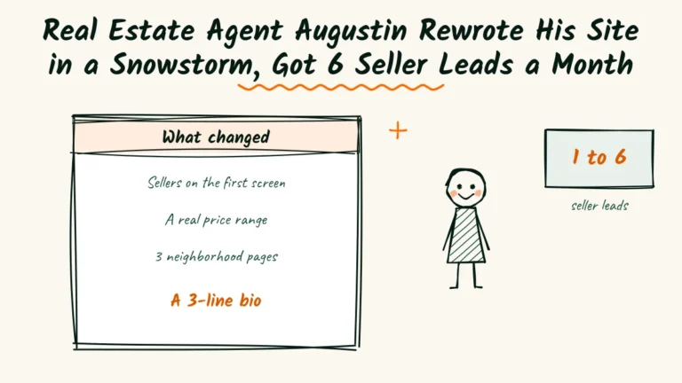
- 1 to 6seller leads a month
- 9price check requests in 2 months
- 5pages rewritten, no redesign
Esthetician Annelise Renamed 1 Facial and Got 17 Online Bookings a Month

- 6 to 17online bookings a month
- 14 to 8services on the menu
- 3rewritten claims per page
Interior Designer Ingeborg Dropped a 12-Step Style Quiz and Got 8 Inquiries a Month
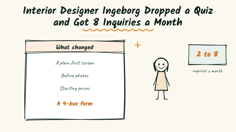
- 2 to 8inquiries a month
- 12 to 4steps before saying hello
- 6project stories with before photos
Personal Branding Photographer Laurel Cut Her Website to 7 Pages

- 2 to 9inquiries a month
- 11 to 7pages on her site
- 9 to 3fields in her form