
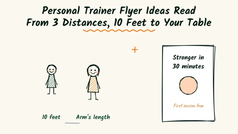

Ten feet. That’s roughly how far away most people are when they first notice your flyer.
From there, they decide in a second or two whether to walk closer. If they do, they read a little more at arm’s length.
If you’re lucky, they take it home and read the rest at the kitchen table.
A personal trainer flyer has to work at all three distances. Most only work at one.
They cram tiny text onto a page that looks like a blur from across the room.
This guide builds your flyer for each distance in turn.
You’ll get headlines that don’t shout, a photo guide, one clear offer and a sample flyer.
There’s also a fill-in template, a word swap list and a few honest places to post it.
Why flyers still work for trainers
It’s easy to think fitness marketing lives only on social media. But personal training is local.
Most clients want a trainer within a short drive of home or work.
A flyer meets people right where they live, work and wait.
A break room, a physical therapy office or a coffee shop near a busy office park.
Paper also feels personal in a way an ad doesn’t.
A clear, friendly flyer from a real local trainer says you’re a neighbor, not a faceless app.
Flyers also reach people who don’t follow fitness accounts at all.
Many of your best future clients never search for workout content online, because they don’t think of themselves as fitness people yet.
The trick is making it readable and calm.
Most fitness flyers do the opposite, with loud colors, shouting slogans and photos that make beginners feel worse about themselves.
Who’s walking past your flyer?
Before you design anything, picture the people who’ll see it. They aren’t gym regulars. Gym regulars already have a plan.
Your best readers are usually people thinking about starting, or starting again.
| Reader | What stops them | What helps |
|---|---|---|
| Office worker with a stiff back | Time and energy | Short sessions near work |
| Parent getting back into shape | Guilt and busy evenings | Early or flexible times |
| Older adult | Fear of injury | Calm, careful coaching |
| Someone finishing physical therapy | Not knowing what’s safe | Working alongside their therapist |
Write for one of these people, not for all of them.
A flyer aimed at a nervous parent will reach that parent far better than a flyer aimed at everyone with a body.

You can print a second version later for a second group.
Many trainers find that one well-aimed flyer does more than three generic ones.
The narrower flyer also tells you more. When the calls come in, you’ll know exactly which kind of client responded.
A personal trainer flyer read from 3 distances
Think of your flyer as three flyers in one. Each distance needs different things, and each one has to earn the next step closer.
Here’s what each distance needs.

From 10 feet, a headline and a face
At ten feet, people see only two things. A few large words and a photo.
The headline should be short, kind and specific. “Stronger in 30 minutes, near the office.” “Back in shape after kids, at your pace.”
The photo should be you, smiling, mid-session with a real client who agreed to be shown.
From ten feet away, a warm face pulls people closer more than any slogan.
Keep everything else small or off this layer entirely. If ten things compete at ten feet, nothing wins.
At arm’s length, the details
Once someone walks closer, they want practical answers. Who is this for? Where? When? How much?
Give them three or four short lines. “One-to-one sessions for beginners. Studio on Pine Street or at your office gym.
Mornings from 6 a.m. First session free.”
This is also where you calm worries.
A line like “No weigh-ins, no shouting, no judgment” does a lot of quiet work for nervous readers.
At the kitchen table, the back side
If someone takes your flyer home, they’re seriously considering it. Now they have time to read.
Use the back for a short story about who you train, a simple first-session plan and a QR code or phone number.
Add a few easy stretches for desk workers, or a short beginner walking plan.
A useful back side keeps the flyer on the fridge for weeks. Every time they see it, your number is right there.
Write headlines that don’t shout
Fitness headlines love exclamation marks.
“Transform your body!” “No pain, no gain!” These scare off exactly the people most likely to hire a personal trainer.
Calm headlines work better for beginners. They sound like a person, not a poster.
- Stronger in 30 minutes, near your office.
- Back in shape after kids, at your own pace.
- Strength training for people over 60.
- Your first workout, without the nerves.
- Feel better at your desk by Friday.
Pick one and test it. A headline that speaks to one real worry beats a clever one every time.

Read each headline from across the room before you choose.
If you can’t read it from ten feet, make it shorter and bigger rather than adding more words.
Choose a photo that invites people in
The photo on a fitness flyer can welcome people or push them away. Many trainers pick the wrong one without realizing.
A chiseled athlete lifting a huge weight looks impressive to other athletes. To a beginner, it says this place isn’t for me.
Choose a photo of you working with an ordinary client. Smiling, mid-movement and clearly enjoying it.
Natural light helps more than any filter.
Always get written permission from any client in the photo. Many are happy to help, especially if they love working with you.

If you’re camera-shy, a photo of your studio, bright and tidy, works too. Just avoid empty, dark rooms full of heavy machines.
Make one offer, not five
Flyers often try to list every package and price. That works on a website, but on a flyer it turns into noise.
Pick one simple offer that makes the first step easy. A free first session, a short starter pack or a free 15-minute chat.
“First session free, no strings” is clear and easy to act on. People don’t need to compare anything.
They just need to say yes to one small step.
Put the price of regular sessions in a small line nearby, so nobody feels tricked later. “Sessions from $55 after that.”
If a free session feels like too much, offer a free 15-minute chat instead.
It still lowers the hurdle, and it gives you a chance to see whether the person is a good fit before booking anything.
Share activity facts without the guilt
Some trainers fill flyers with scary health statistics. Guilt rarely gets people moving, and it can make a flyer feel preachy.
A gentle fact works better.
The CDC’s physical activity guidelines for adults suggest about 150 minutes of moderate activity a week, plus some muscle strengthening.
You can turn that into a friendly line. “That’s about 30 minutes, five days a week. We’ll help you get there, one session at a time.”
The fact supports your offer without lecturing anyone. People feel informed, not judged.

Pick places where people pause
Where your flyer hangs matters as much as what it says. Look for places where your ideal client stands still for a minute or two.
| Place | Who sees it | Tip |
|---|---|---|
| Office break room | Desk workers | Ask the office manager first |
| Physical therapy clinic | People finishing rehab | Offer to work with their therapist |
| Coffee shop near offices | Busy professionals | A small stand-up card works well |
| Community center | Older adults, parents | Ask about their notice board rules |
| Apartment building gym | Residents nearby | Ask the building manager |
Always ask before posting. Owners appreciate being asked, and many will keep your flyer up longer if you did.
Bring a few thumbtacks or a roll of tape with you.
Many boards are missing both, and a flyer that falls behind a radiator helps nobody.
If a spot has a strict rule about size, print a small card version. A neat card in the right spot beats a big flyer in the wrong one.
Visit each spot once a month to swap faded flyers for fresh ones.
A sun-bleached flyer quietly suggests a trainer who’s no longer around.

Team up with physical therapists and dietitians
Some of your best clients come right after physical therapy.
They’ve finished their sessions, they want to keep going and they don’t know how.
Introduce yourself to local physical therapists.
Explain how you work with clients coming out of rehab, and leave a small stack of flyers.
Dietitians are another good partner. Their clients often want help with exercise but don’t know where to start.
Offer to return the favor. If a client asks you about meal plans, you can point them to the dietitian.
Referrals that run both ways last much longer than one-sided ones.
Keep these partner flyers a little different.
Add a line like “Happy to work alongside your physical therapist.” It shows respect for their work and makes referrals feel safe.
Pick colors and type that read from across the room
Design matters most at the ten-foot distance. If people can’t read your flyer from across a break room, the words never get a chance.
Use dark text on a light background. It reads clearly under office lights, in sunny windows and on cluttered boards.
Neon colors grab attention for a moment, then make everything harder to read.
Choose one plain, bold font for the headline and one simple font for the rest.
Fancy scripts and stretched letters look stylish up close and turn into scribbles from a distance.
Leave space around the headline and the photo. Empty space isn’t wasted.
It’s what lets the important parts stand out on a crowded board.
If you have brand colors, use one of them as an accent, like a stripe along the top or the color of the offer line.
One accent color looks confident. Five colors look like a party invitation.

Add a QR code that goes somewhere useful
A QR code lets people act on your flyer without typing a phone number.
But it only helps if it leads somewhere that keeps the flyer’s promise.
Don’t send people to your homepage and make them search.
Send them to a short page that matches the flyer, with the same headline, the same offer and a simple booking form.
If your flyer promises a free first session, the page should open with exactly that.
A visitor who has to hunt for the offer usually gives up.
Test the code with three different phones before you print.
Make it at least an inch wide, and keep it away from the edge so it doesn’t get cut off.
Use a different link for each place you post. That way, you’ll see which spots send people to your page.

Hand flyers out in person
A flyer on a board waits for someone to notice it. A flyer handed over with a smile starts a conversation right away.
Look for natural moments. A local 5K, a farmers market, a health fair at a big employer or a community class you teach for free.
Keep the conversation short and kind.
Ask one question, like “Are you training for anything this year?” Listen, then hand over the flyer if it fits.
Never push a flyer on someone who isn’t interested.
People remember the trainer who was pleasant far longer than the one who was persistent.
Carry a small stack in your bag at all times.
You never know when a neighbor or a coworker’s friend will mention they want to get stronger.

Leave these off your flyer
Some things look like they belong on a fitness flyer but quietly hurt it. Leaving them off makes everything else stronger.
Skip long lists of certifications. One short line is enough, and the rest can live on your website.
Skip weight-loss promises and dramatic before-and-after photos.
They can feel pushy, they may not represent typical results and they often scare away beginners.
Skip social media icons for every platform. Pick one way to reach you and make it big.
A flyer with six ways to get in touch often gets none.
Skip fine print about cancellation fees. Explain those kindly when someone books, not on the first piece of paper they see.
Read a sample flyer
Here’s how all three distances look on one flyer for Ruthanne, a trainer in Yakima, Washington.
She works mostly with office workers.
Stronger in 30 minutes, near the office.
One-to-one sessions for beginners. Studio on Pine Street, or your office gym.
Mornings from 6 a.m. No weigh-ins, no shouting, no judgment.
First session free. Sessions from $55 after that.
Text Ruthanne at 509-555-0136.
On the back, she adds five stretches for desk workers and a short plan for the first two weeks.
People keep it at their desks, and the phone number stays in view.

Fill in your own
Use this template for the front of your flyer. Keep each line to one sentence.
[A short, kind headline about one worry.]
[Who it’s for and where sessions happen.]
[When, plus one line that calms nerves.]
[One simple offer and a regular price.]
[How to reach you.]
Then add something useful on the back. A few stretches, a beginner plan or a short story about a client you helped.
The personal trainer website guide pairs well with this. Put a QR code on the back that leads to your first-session page.
Swap gym words for everyday words
Trainers often use words that make beginners nervous. On a flyer, plain words win.
| Gym words | Everyday words |
|---|---|
| HIIT circuits | Short bursts with rests |
| Body recomposition | Feeling stronger and fitter |
| Progressive overload | Getting a little stronger each week |
| Functional training | Moves that help in daily life |
| Bootcamp | Small group sessions |
Read your flyer aloud. If a word would confuse your neighbor, swap it.

The interior designer flyer guide makes a similar point about one focus and plain words, for a very different business.
Match flyers to the fitness calendar
Interest in fitness rises and falls through the year. Your flyers can follow it.
In January, many people want a fresh start. In spring, people think about summer and outdoor activities.
In September, parents get their mornings back once school starts.
Change the headline to fit the season, and keep the rest the same.
“New year, steady start” in January. “Get your mornings back” in September.
Print small batches for each season. Fresh flyers get noticed. Old ones blend into the board.
Test it on an elevator ride
Before you print hundreds, test your flyer on a few people outside fitness. The elevator test is quick and honest.
Show it for 30 seconds
Hand your flyer to a friend for about as long as an elevator ride. Then take it back.
Ask who it’s for, what the offer is and how to reach you. If they miss any of those, make that part bigger or clearer.
Check it from across the room
Pin the flyer on a wall and walk ten feet away. Can you read the headline? Can you see your face clearly?
If not, cut words and make the type bigger. Ten feet is where most people decide whether to come closer.

Track which spots bring clients
Flyers feel like guesswork until you track them. A simple system shows you where to spend your time.
Use a code for each spot
Give each location its own short code or QR link.
“Mention PINE for a free session” at one coffee shop, “Mention PT for a free session” at the physical therapy clinic.
After a month or two, the codes tell you which spots work.
Ask every new client
On the first call or message, ask how they heard about you. Write the answer down every time.
A small notebook or a note on your phone is enough. Patterns appear faster than you’d expect.
Refresh it every season
Flyers fade, and so does attention. A little upkeep keeps them working.
Swap faded copies
Visit each spot once a month and replace anything faded, torn or covered. A crisp flyer looks like an active trainer.
Update the details
Check your prices, hours and photo every season. If your mornings are fully booked, say so and offer evenings instead.
An honest “waitlist for mornings” can even make people more interested.
Close the distance
A personal trainer flyer has three jobs, at three distances.
Pull people closer from ten feet, answer their questions at arm’s length and stay useful at the kitchen table.
The chance is real. Most fitness flyers still shout, so a calm, friendly one stands out on any board.
The pressure is real too. Cheap gym memberships and fitness apps compete for the same beginners, often with big discounts.
A local trainer who feels kind and approachable is what those apps can’t offer, and a good flyer is often the first place people feel it.
So this week, design one flyer for one kind of client.
Test it from ten feet, post it in two places where people pause and ask every caller how they found you.
Frequently Asked Questions
Can I post fitness flyers inside a big gym?
Usually not, since most gyms protect their own trainers. Focus on offices, clinics and community spaces instead.
Should I include before and after photos on a flyer?
It’s risky and often feels pushy. A friendly photo of you coaching a real client works better for beginners.
What paper should I print fitness flyers on?
A sturdy matte paper looks professional and is easy to read under bright lights or sunlight.
Do tear-off tabs still work for trainers?
They can in community centers. A QR code is often easier and lets you track which spot brought the call.
How much should I spend on my first batch?
Start small, about 100 to 200 flyers, and test a few spots before printing more.

Read next
What to Put on a Product Photographer Flyer, From Sticker to Booth Sign (6 Sizes)
Online sellers still meet you in person. Write six print pieces, from a parcel sticker to a booth sign, that all say one thing.
Read NowWhat to Put on a Plumber Flyer, Built Like a Pipe in 4 Parts
Build your flyer like a pipe, four parts from headline to phone number, so it stays in the drawer until the day a pipe bursts.
Read NowMath Tutor Flyer Ideas, Solved Like a Word Problem in 5 Steps
Build your tutoring flyer like a word problem, five steps parents follow in seconds, plus a tiny puzzle kids stop to solve.
Read Now